Advisor Charts
To view charts for Advisor's Customer Pay Labour Sales, Labour Sales by Sale Type, or Repair Order Counts:
Click the Report Group drop down and select by advisor.
Click the Data Source Name drop down and select one of the following:
1. CP Labour Sales by Advisor
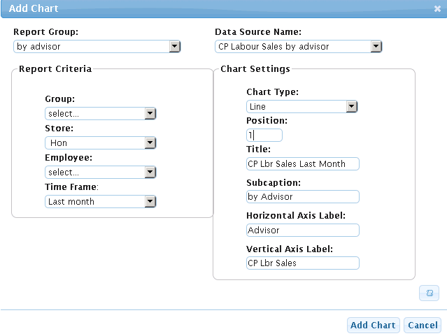
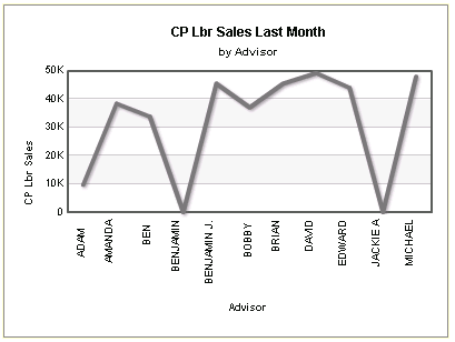
This chart represents Customer Pay Labour Sales by Advisor. Use this to review the sales across a group, store or both by selecting the drop downs for Group and/or Store.
To view individual advisor sales, select the Employee drop down.
For the Chart Type, select either Line or Column 2D/3D. These type of charts are the best to display the sales information for advisors.
See images below:
Figure 1: Adding a line chart per advisor for CP Labour Sales for an individual store for last month. To view a Column2D/ 3D, select it from the Chart Type drop down
Figure 2: In the image above, the settings render a chart similar to below:
2. Labour Sales by Advisor by Saletype
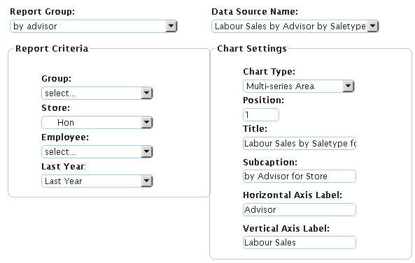
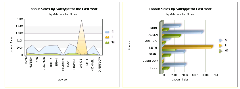
This gives a visual of labour sales per Advisor for Customer, Internal or Warranty pay.
Use this to review the sales across a group, store or both by selecting the drop downs for Group and/or Store.
To view individual advisor sales, select the Employee drop down.
For the Chart Type, select either Multi-series Bar 3D or Multi-Series Area. These type of charts are the best to display the sales information for advisors.
See images below:
Figure 3: Adding a Multi-Series Area Chart per advisor for Labour Sales By Advisor By Salestype. To view a Multi-series Bar 3D as displayed below, select it from the Chart Type drop down.
Figure 4: In the image above, the settings render charts similar to below. Chart on the left Multi-series Area; chart on the right Multi-series Bar 3D:
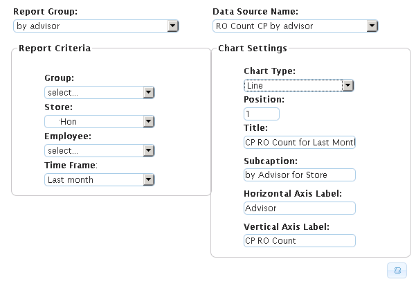
3. CP RO Count
This gives a visual of Customer Pay Repair Order Counts per Advisor.
Use this to review the sales across a group, store or both by selecting the drop downs for Group and/or Store.
To view individual advisor sales, select the Employee drop down.
For the Chart Type, select Line, Column or Pareto. These type of charts are the best to display the repair information for advisors.
Note: Pareto charts individual values are represented in descending order by bars, and the cumulative total is represented by the line.
See images below:
Figure 5: Adding a Line chart per advisor for CP RO Count. To view a Column or Pareto chart, as displayed below, select those from the Chart Type drop down.
Figure 6: In the image above, the settings render charts similar to below. Charts from left to right: Line, Column, Pareto

